


Podtas
Usa el Baño Como Si Hubieras Cometido un Crimen Metal Sign
Usa el Baño Como Si Hubieras Cometido un Crimen Metal Sign
Couldn't load pickup availability
Funny Bathroom Wall Decor
A bathroom reminder guests will actually remember
“Usa el baño como si hubieras cometido un crimen” gives a simple cleanup reminder a mischievous twist. Hang this Spanish-language metal sign in a guest bathroom, powder room, or restroom to bring a smile to a routine space.

Why it works
- A playful nudge: humorous Spanish wording makes the message memorable without a stern-looking rule sign.
- Everyday display: an easy conversation piece for a home bathroom or guest space.
- Ready to mount: printed metal sign with pre-drilled holes.
Product details
8 × 12 in metal sign with flat printed artwork. Choose this design as shown; it is not a photo-upload product. Colors may vary slightly by screen and lighting. Check the product images for the artwork and size details.
🚚 FREE Standard U.S. Shipping on orders $14.99+
↩️ 30-Day Replacement Support
📦 Carefully packed for safe delivery
📍 Tracked U.S. Shipping


Careful print review confirmed that the Spanish bathroom message remained sharp and easy to read during the first full look after unpacking. The wording stayed crisp and the humorous message was immediately understandable. Spacing around the main phrase helped the message feel uncluttered. The sign combined readable printing with dependable construction.
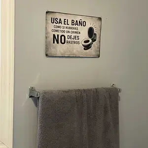
Careful material review found that the design felt balanced from the center toward the edges when viewed from a slight side angle. The border, lettering, and background worked together naturally. The final composition felt playful, readable, and neatly organized. The material and print quality supported a polished finished appearance.
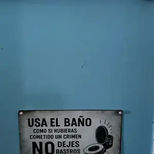
Direct edge inspection showed that the corners looked tidy and consistently shaped after being placed on the wall. The design stayed clean across both large lettering and smaller elements. The Spanish wording kept its playful tone while remaining easy to follow. The overall quality made the product feel carefully produced.
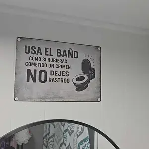
Focused finish study highlighted how the wording appeared straight and evenly aligned in a hallway bathroom. The playful tone came through clearly while the construction still looked neat. The bathroom theme remained obvious without relying on oversized graphics. The final result felt clean, practical, and easy to display.
Initial text inspection noted that the material, edges, and print worked together reliably within the completed bathroom setup. The print looked polished without any distracting faded areas. The main phrase remained the focal point while the surrounding design stayed balanced. The finished piece added humor without looking cheaply made.
Detailed quality assessment documented that the size and layout suited a bathroom wall or door under bright bathroom lighting. The overall presentation felt well suited to a casual bathroom space. The layout worked well for a lighthearted bathroom reminder. The bathroom message remained clear and visually balanced.
Detailed finish study revealed that the print density stayed consistent across the full design in a guest bathroom. The construction was solid overall, with a small variation near one edge. The wording and border felt visually connected rather than separated. The humorous design stayed easy to notice without feeling excessive.
Complete material review made it clear that the printed colors looked balanced without appearing overly bright during a close inspection. The material felt sturdy while remaining easy to hang. The print maintained a clean appearance around every letter and corner. It looked ready for regular display in the bathroom.
Side-angle finish study observed that the outer edges appeared neat and properly finished when displayed on a bathroom door. The finish looked even and gave the sign a dependable appearance. The sign maintained a casual bathroom style with a tidy printed finish. The sign worked well as a lighthearted bathroom accent.
Careful display review confirmed that the colors reproduced cleanly and suited the humorous theme in a powder room. The wording stayed crisp and the humorous message was immediately understandable. Spacing around the main phrase helped the message feel uncluttered. The sign combined readable printing with dependable construction.
Mounted layout check verified that the font style stayed legible while keeping the playful character from a normal standing distance. The surface showed no obvious rough patches or uneven printing. The decorative treatment supported the joke without reducing readability. The completed sign looked neat from both close and normal distances.
Focused display review showed that the contrast kept the wording visible from across the room under softer indoor lighting. The sign felt reliable, with a minor finish difference visible only up close. The Spanish wording kept its playful tone while remaining easy to follow. The overall quality made the product feel carefully produced.
Indoor text inspection found that the text and decorative elements kept natural proportions during the first full look after unpacking. The border, lettering, and background worked together naturally. The final composition felt playful, readable, and neatly organized. The material and print quality supported a polished finished appearance.
Side-angle quality assessment highlighted how the finish remained consistent across the front surface after being placed on the wall. The playful tone came through clearly while the construction still looked neat. The bathroom theme remained obvious without relying on oversized graphics. The final result felt clean, practical, and easy to display.
Close print review made it clear that the full design looked clean and professionally printed when viewed from a slight side angle. The material felt sturdy while remaining easy to hang. The print maintained a clean appearance around every letter and corner. It looked ready for regular display in the bathroom.
Detailed surface check revealed that the sign material felt solid and dependable in a hallway bathroom. The text remained readable without needing to stand close to it. The wording and border felt visually connected rather than separated. The humorous design stayed easy to notice without feeling excessive.
Direct print review documented that the background printed evenly without distracting patches during a close inspection. The overall presentation felt well suited to a casual bathroom space. The layout worked well for a lighthearted bathroom reminder. The bathroom message remained clear and visually balanced.
Mounted display review noted that the sign was noticeable without overwhelming the bathroom decor in a guest bathroom. The print looked polished without any distracting faded areas. The main phrase remained the focal point while the surrounding design stayed balanced. The finished piece added humor without looking cheaply made.
Indoor surface check observed that the lettering edges looked clean without blurred strokes under bright bathroom lighting. The finish looked even and gave the sign a dependable appearance. The sign maintained a casual bathroom style with a tidy printed finish. The sign worked well as a lighthearted bathroom accent.
Initial edge inspection confirmed that the sign looked carefully assembled and ready to display when displayed on a bathroom door. The wording stayed crisp and the humorous message was immediately understandable. Spacing around the main phrase helped the message feel uncluttered. The sign combined readable printing with dependable construction.
Indoor material review showed that the border helped frame the message without covering any lettering from a normal standing distance. The design stayed clean across both large lettering and smaller elements. The Spanish wording kept its playful tone while remaining easy to follow. The overall quality made the product feel carefully produced.
Initial display review verified that the humorous bathroom wording looked centered and well spaced within the completed bathroom setup. The surface showed no obvious rough patches or uneven printing. The decorative treatment supported the joke without reducing readability. The completed sign looked neat from both close and normal distances.
Focused edge inspection found that the printed surface looked smooth and evenly finished in a powder room. The wording remained clear, though one darker section looked slightly more muted. The final composition felt playful, readable, and neatly organized. The material and print quality supported a polished finished appearance.
Careful edge inspection highlighted how smaller decorative details remained visible and well defined under softer indoor lighting. The playful tone came through clearly while the construction still looked neat. The bathroom theme remained obvious without relying on oversized graphics. The final result felt clean, practical, and easy to display.
Mounted surface check made it clear that the joke came through clearly without the design feeling crowded during the first full look after unpacking. The material felt sturdy while remaining easy to hang. The print maintained a clean appearance around every letter and corner. It looked ready for regular display in the bathroom.
Focused print review revealed that the Spanish bathroom message remained sharp and easy to read after being placed on the wall. The text remained readable without needing to stand close to it. The wording and border felt visually connected rather than separated. The humorous design stayed easy to notice without feeling excessive.
Indoor display review noted that the design felt balanced from the center toward the edges in a hallway bathroom. The print looked polished without any distracting faded areas. The main phrase remained the focal point while the surrounding design stayed balanced. The finished piece added humor without looking cheaply made.
Focused material review observed that the wording appeared straight and evenly aligned during a close inspection. The finish looked even and gave the sign a dependable appearance. The sign maintained a casual bathroom style with a tidy printed finish. The sign worked well as a lighthearted bathroom accent.